
(The first entry in this series can be found here.)
Welcome back!
In this post, we continue our exploration of what possibilities Dependency Map can bring to SaFE planning!
In the last instalment, we learned how to bring together issues from several different projects into the same map, and how to use the field value filtering and group merging features of Dependency Map to create a coherent SaFE Program Board. (You can find out more about SaFE here.)
Let’s move on to dependency management, which is – arguably – the most important part of all work planning processes!
In the SaFE framework, dependencies are identified and dealt with during the team breakout sessions in the Program Increment Planning meeting. This is where the team members figure out how the features to be built fit together technically. The idea is to identify features that cannot be delivered until one or several other features have been delivered. For example, it might not be possible to deliver the design of a media infotainment system for a car unless the full specifications for the electrical system and the interior design for the instrument panel are complete.
Creating Jira links with Dependency Map
Using the standard Jira interface to add links to issues can be a bit cumbersome, but this is where Dependency Map can help! Jira has a built-in link type called “Blocks” which is included in all maps by default. To add a new link of that type between two issues, click on the first issue to select it:
Then, shift-click on the second issue to add it to the selection:
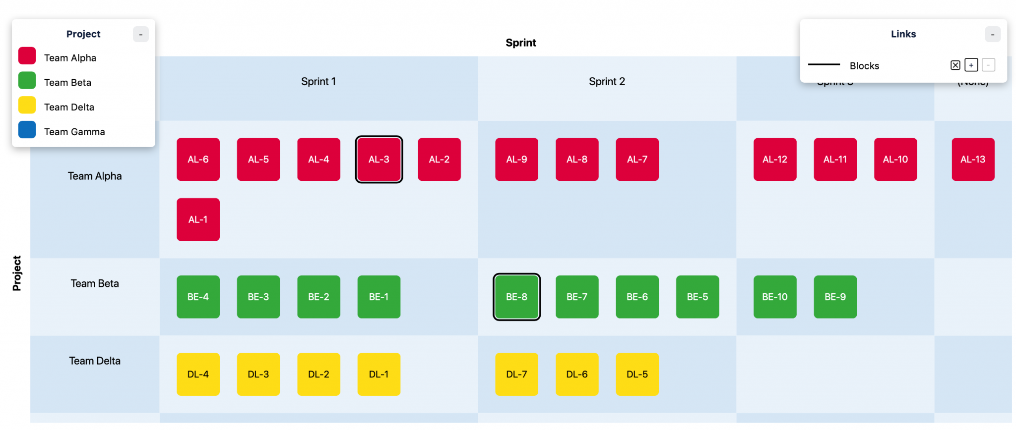
Then, press the small ‘+’ button next to the “Blocks” link type in the upper right corner of the map:
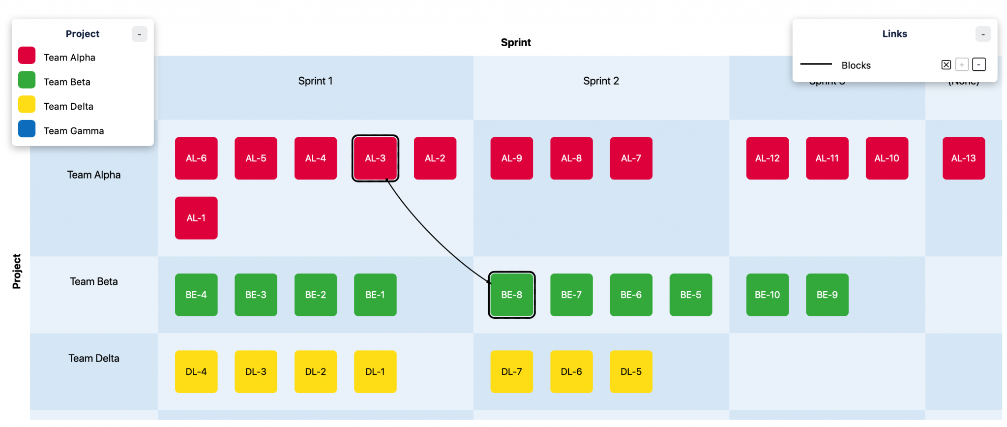
That’s all there’s to it! Removing a link is just as simple, simply select the two issues and click the ‘-‘ button.
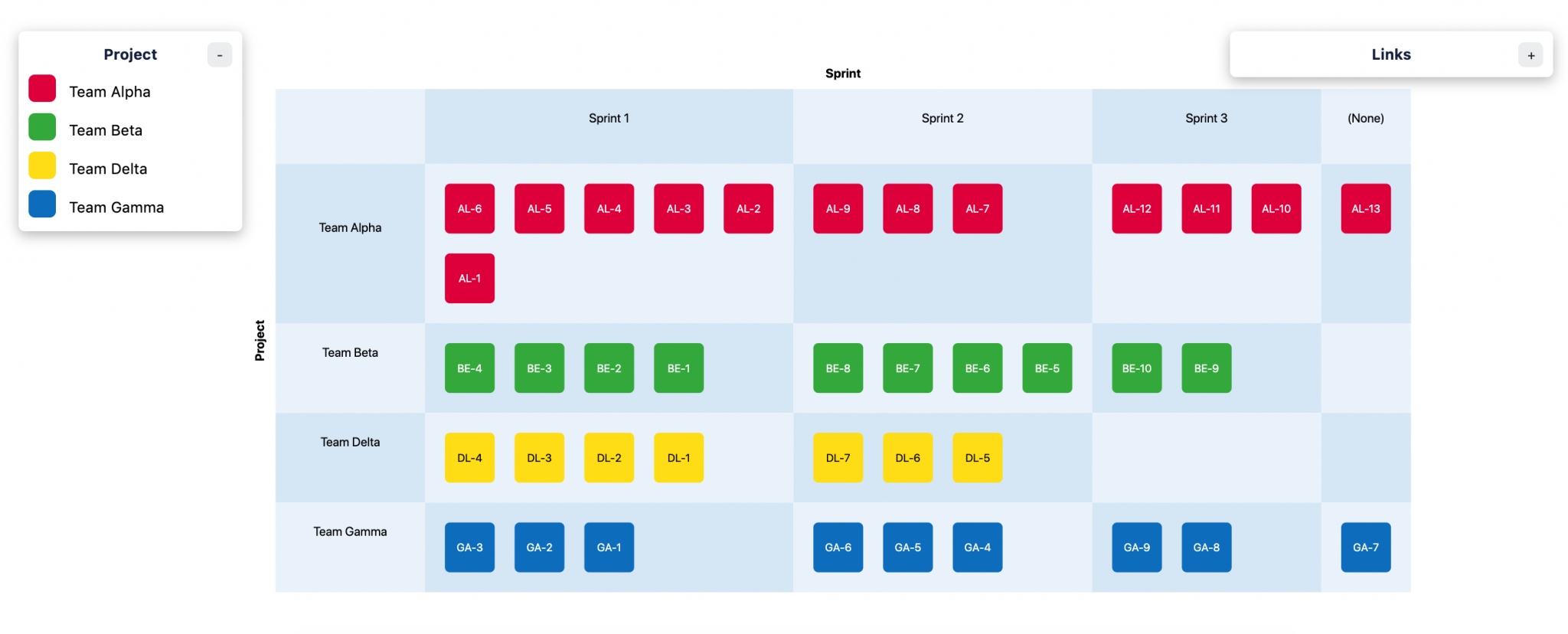
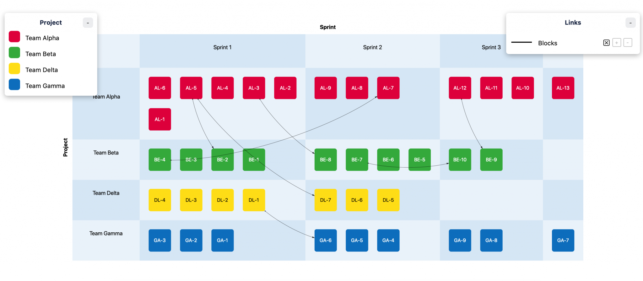
Now that we know how to create links quickly in Dependency Map, it’s easy to complete the Program Board. (If several persons are working in the same map simultaneously, you may have to reload the page to see the current version of the map.) The result might look something like this:
Visualising feature complexity
Now that we have a general overview of who’s doing what (and when), we can continue to explore the project in other ways. One question we might want to ask is whether the plan is reasonable given the (estimated) complexity of the features to be implemented.
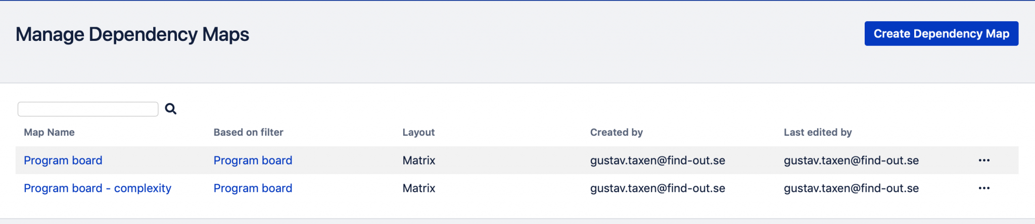
Let’s begin by assuming that we have a custom field in Jira called “Complexity” with three different possible values: “Low”, “Medium” and “High”. Then, go the “Manage Maps” screen in Dependency Map and duplicate the program board map:
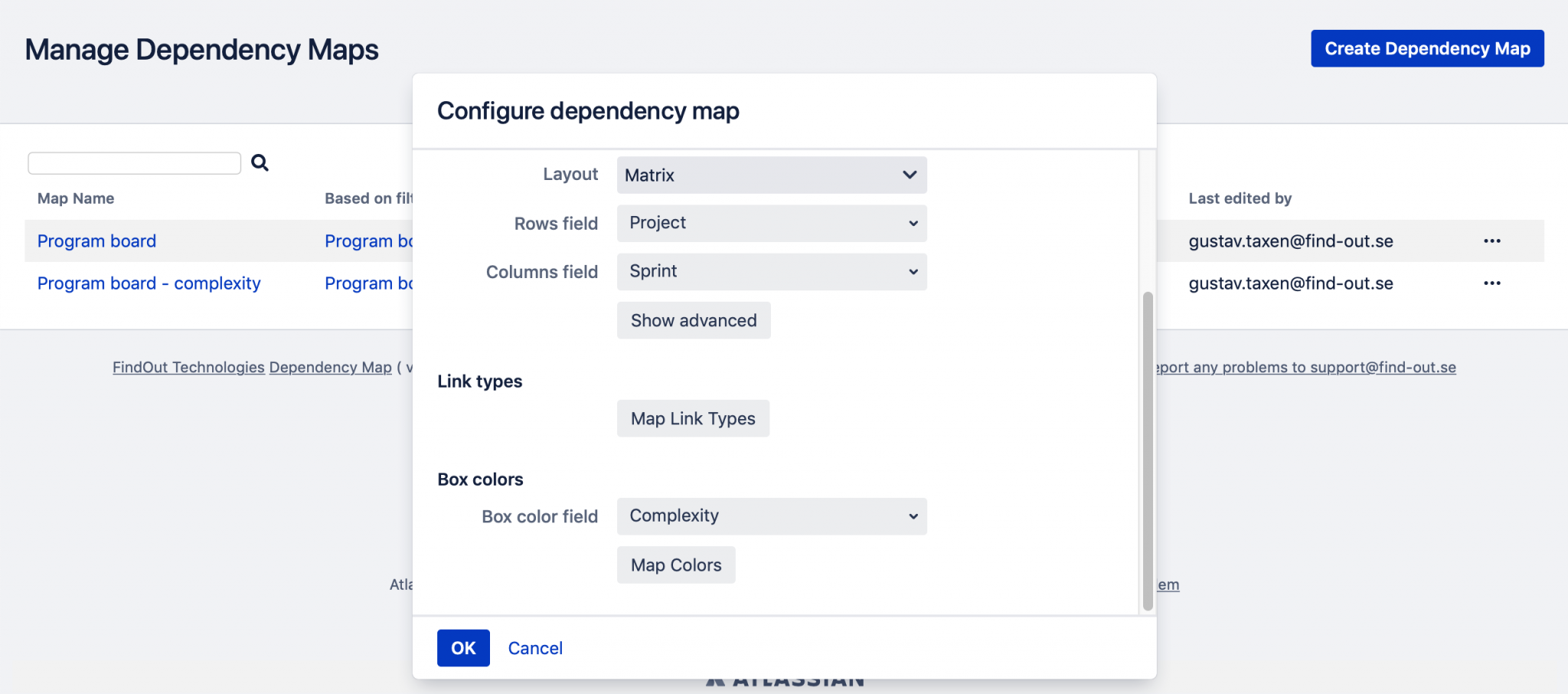
To configure the new map, we click on the “…” button to the right and select “Configure”. We then select “Complexity” as the field for the box colors:
To select colors for the values of the “Complexity” field, we click the “Map Colors” button:
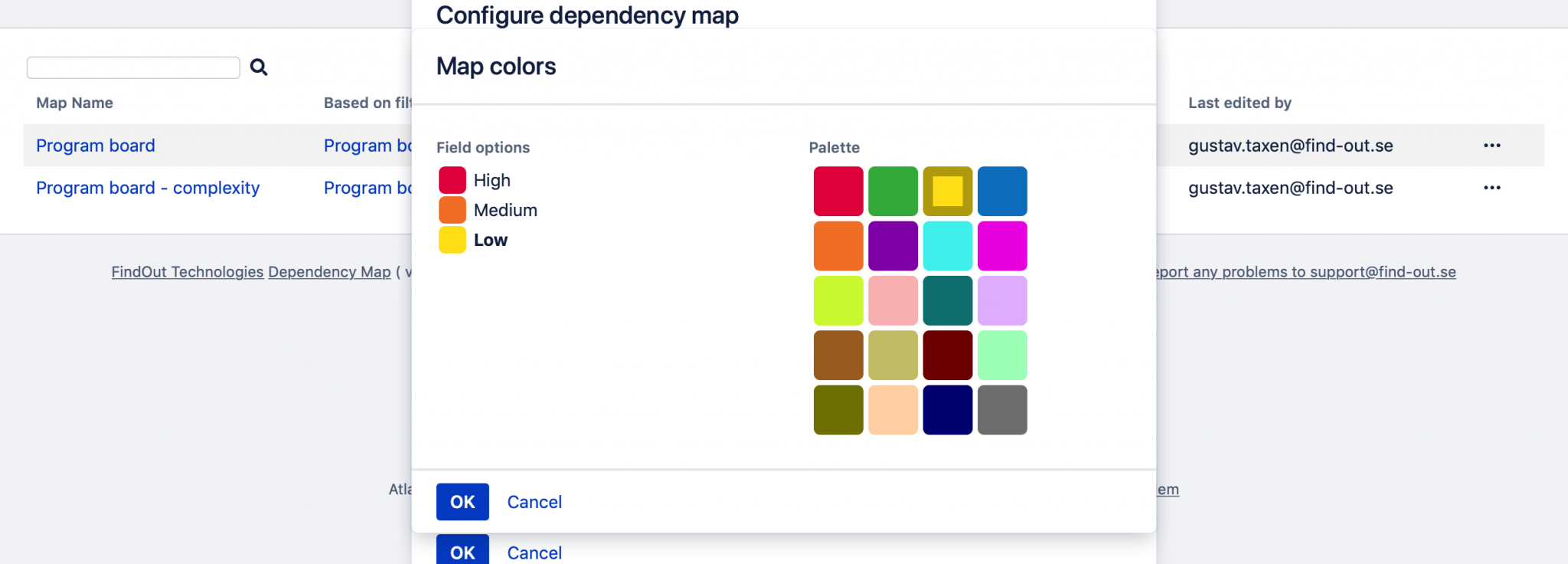
In this example, we have selected red to represent “High”, orange to represent “Medium” and yellow to represent “Low” complexity.
Opening our new map gives us this:
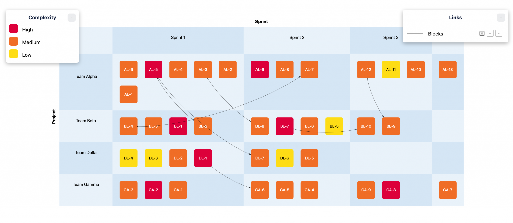
We can see that features that block other features tend to be more complex than features that do not – which makes sense. We can also see that the majority of the features planned for our next three sprints are of medium complexity. Team Delta, however, have been assigned two low complexity features in sprint 1, and none of them depend on anything else.
Something that may be cause for concern is that Team Alpha have been assigned a larger number of features than the other teams in sprint 1, and none of them have low complexity. If this is a problem that must be dealt with depends on what we know about Team Alpha, of course. If the team is experienced and confident, it may not be a problem at all. But visualising the project in this way provides a perspective that points our attention to a kind of problem that can be difficult to “see” in a standard program board.
Let’s try another perspective!
Visualising project status
Once our first sprint is underway, it is likely that we want to see what the overall status of the project is.
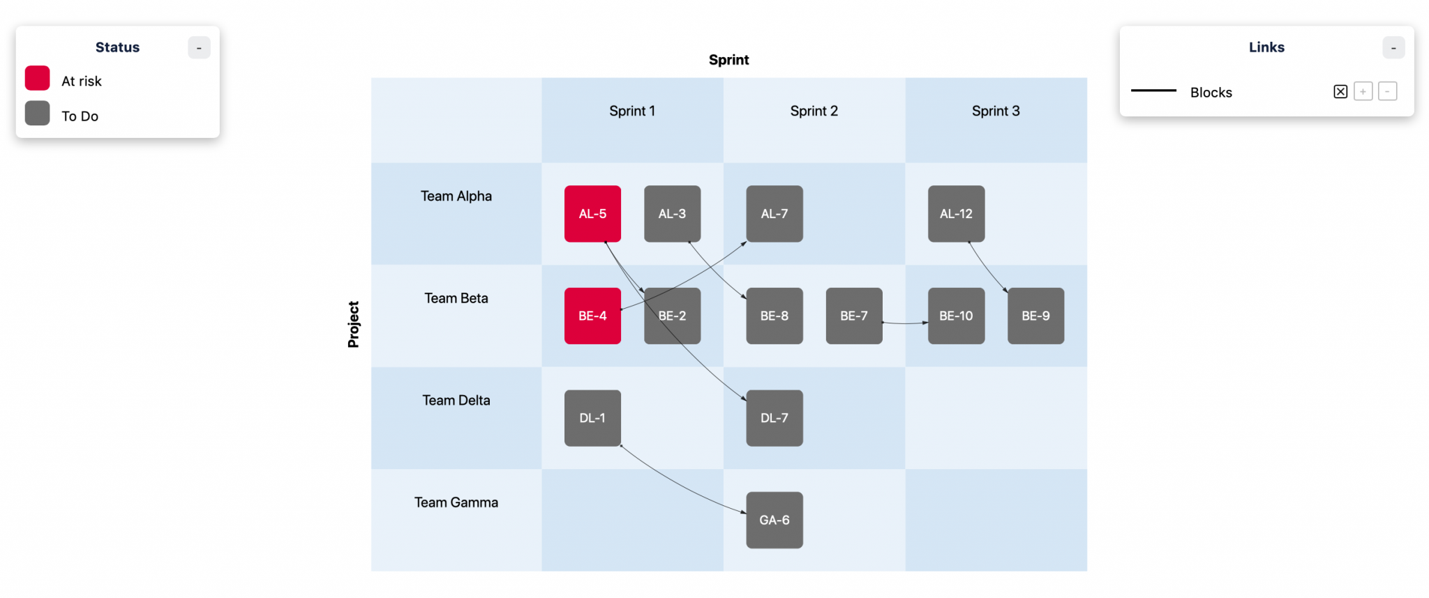
Let’s duplicate the Program Board map again, and select “Status” as the field for box colors:

Note that in this example, we have added a status called “At risk” to the project workflow. This isn’t part of the standard set of statuses in Jira, but it can be useful since it allows us to distinguish between features that are in progress according to plan and features that risk being delivered late.
Opening the new map gives us this:

This proves that our fears about Team Alpha may have been correct after all! The red feature called “AL-5” is now at risk, but there is now an additional concern: if “AL-5” is at risk, this also means that feature “BE-2” is likely to be at risk too, because of the dependency. This is particularly bothersome because “AL-5” is expected to be delivered to Team Beta in the current sprint. At this point we should talk to the teams about how to mitigate the problem.
An additional headache is the feature called “BE-4”: it is also at risk, which might cause a delay of “AL-7” (which is planned for the next sprint). However, it may be OK to let “BE-4” slip into sprint 2, since there is still a possibility that Team Beta can deliver it to Team Alpha in time for them to complete “AL-7”.
If we want to highlight these kinds of dependency related problems even further, we can create a copy of our Jira filter and configure the new filter to only include issues that “blocks” or are “blocked by”:
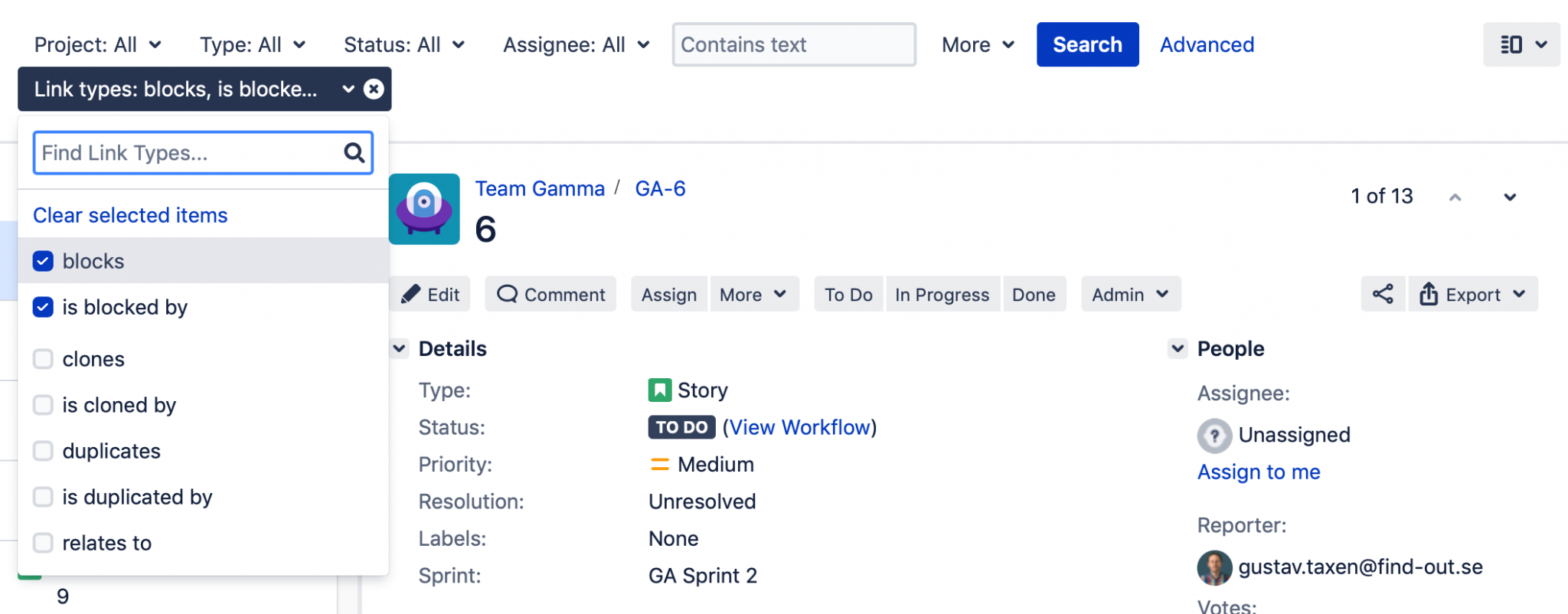
Using this filter in the status map gives us this result:
This visualisation helps us see dependency-related problems immediately, without the additional clutter of “independent” issues.
This concludes our two-part series on how SaFE program boards can be created in Dependency Map. Hopefully, these posts have provided you with at least some ideas of what’s possible to do! Feel free to download a free trial from Atlassian Marketplace and experiment!
If you want to be notified of new posts and other news related to Dependency Map, sign up for our newsletter!